top of page
Microbrandz
Design Brief
The primary objective of this project was to meticulously craft a visually accessible logo and website for Microbrandz. The emphasis was on creating a design that not only captures the essence of Microbrandz but also ensures visual accessibility, providing a seamless and engaging experience for users interacting with both the logo and the website.
Solution
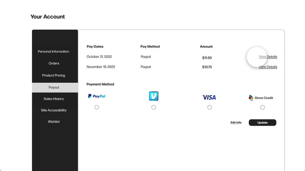
In this collaborative project, I worked with fellow designers to develop both a logo and a website. The logo comprises four drops symbolizing ink, with the letter "Z" cleverly integrated into the negative space of the droplets, symbolizing Generation Z. The website was made using Adobe XD. Communication was key as we ensured that our designs harmonized seamlessly. Attention was paid to visual accessibility, with a careful selection of colors and font sizes to enhance overall user experience.
bottom of page


